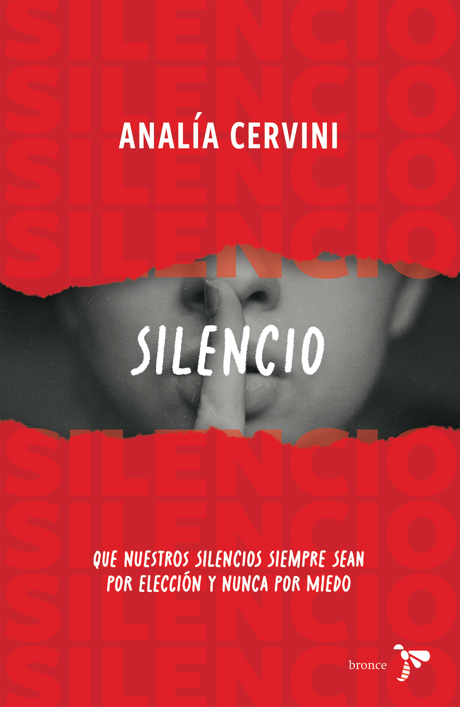
Design and conceptualization of the cover for the book "Silencio" (silence), published by Bronce (a publishing imprint from Grupo Planeta).
Context: This book tells the story of a woman who was the victim of multiple forms of abuse. Historically, this has been a topic that has not been discussed much, either out of fear of the repercussions for the victims or because nothing is being done about it. This book aims to do just the opposite: to raise awareness of the violence that many women have experienced throughout history.
Challenge: How can we make the cover of a topic that has been consistently invisible, visually striking and appealing to potential readers?
Design decisions: I wanted to play with the image of a woman making a shushing gesture, an image that begins to emerge from the red background. This emergence of the image—the fact that it starts to become visible—symbolizes the strength with which women have begun to break their silence to tell their stories, even though their aggressors threaten them and even though society itself does not want these stories to be made public.
I chose a hand-drawn-style font to give it an intimate feel (as if the author had written it herself). I used a pattern where the word “silence” is repeated many times, precisely because that is what has always been demanded of women. And finally, the red background symbolizes the blood associated with these abuses.
I chose a hand-drawn-style font to give it an intimate feel (as if the author had written it herself). I used a pattern where the word “silence” is repeated many times, precisely because that is what has always been demanded of women. And finally, the red background symbolizes the blood associated with these abuses.
The result: a cover design in which every decision contributes to the goal of bringing attention to an issue that has been swept under the rug for years.
Diseño y conceptualización de la portada del libro “Silencio” del sello Bronce de la editorial Planeta.
Contexto: este libro cuenta la historia de una mujer que fue víctima de múltiples abusos. Históricamente, este ha sido un tema del que no se ha hablado mucho por temor a las repercusiones para las víctimas o porque simplemente no pasa nada. Este libro busca justamente lo contrario: aportar a la visibilidad de las violencias que han vivido muchas mujeres a lo largo de la historia.
Reto: ¿cómo hacer que la cubierta de un tema que ha sido invisibilizado constantemente tenga un impacto visual y sea llamativo para las posibles lectoras?
Decisiones de diseño: quise jugar con la imagen de una mujer haciendo la seña de silencio, imagen que empieza a aparecer en medio de la trama roja. Este surgir de la imagen, el que se empiece a ver, simboliza la fuerza con la que las mujeres han empezado a romper el silencio para contar sus historias, a pesar de que sus agresores las amenacen, aunque la misma sociedad no quiera que estas se hagan públicas.
Elegí una tipografía que parece hecha a mano para darle tono de intimidad (como si la autora lo hubiera escrito). Utilicé una trama donde se repite la palabra “silencio” muchas veces, precisamente porque es lo que siempre le han pedido a las mujeres. Y por último, el color rojo del fondo simboliza la sangre que está atada a estos abusos.
Elegí una tipografía que parece hecha a mano para darle tono de intimidad (como si la autora lo hubiera escrito). Utilicé una trama donde se repite la palabra “silencio” muchas veces, precisamente porque es lo que siempre le han pedido a las mujeres. Y por último, el color rojo del fondo simboliza la sangre que está atada a estos abusos.
El resultado: un diseño de cubierta que aporta con cada decisión a la intención de dar visibilidad a un tema que ha sido encubierto por años.