Cover design, layout and conceptualization for the book "Dar (el) nombre" (To Give (the) Name), published by the University of Bogotá Jorge Tadeo Lozano Press.
Context: Alfredo Lèal’s essay explores the relationship between author and publisher in Western literary history. Through his working notes, the author reflects on the imprint left by those involved in the publication of a book through each decision they make.
Challenge: to design a book based on a complex, abstract idea that is difficult to bring to life. The book’s title is a conceptual play on words, where parentheses play a fundamental role in making room for a decision, a chosen path agreed upon between the author and the publisher. It is not about giving just any name… it is about giving (the) name. The cover and layout were meant to make this intellectual play visible without illustrating it literally.
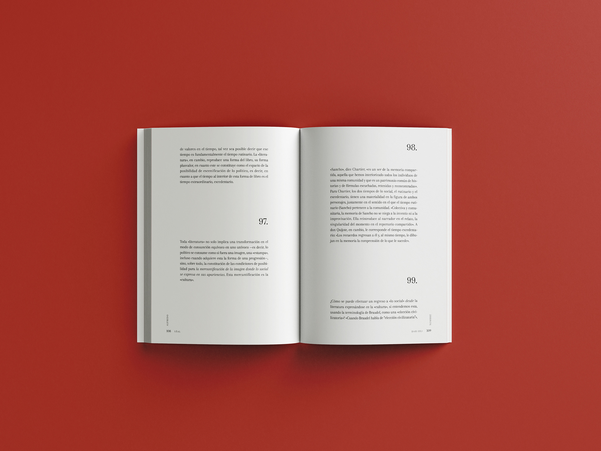
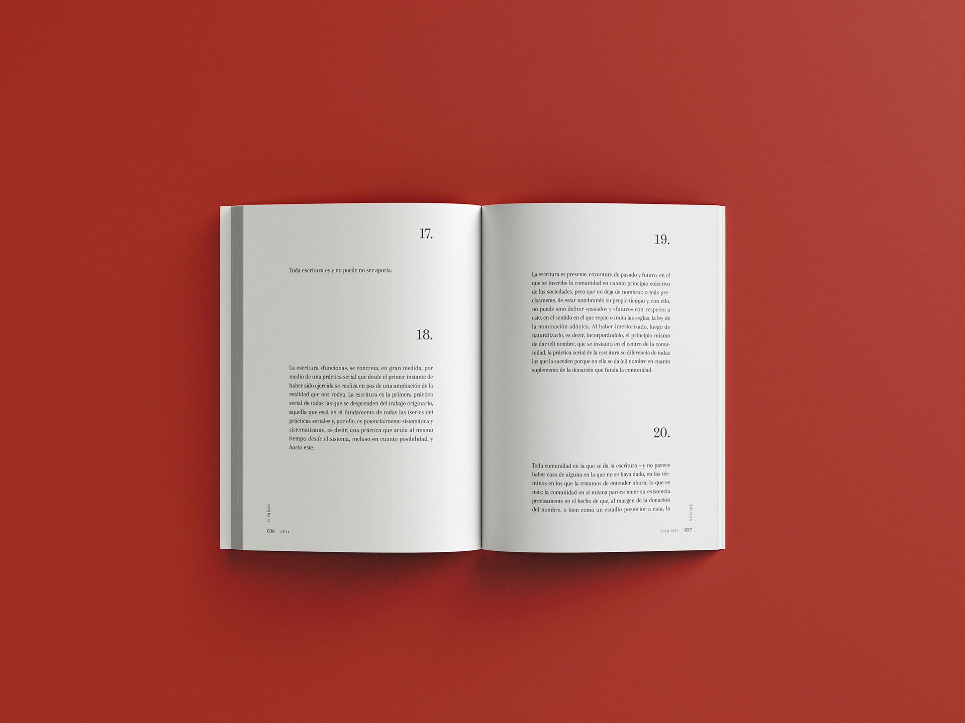
Design decisions: typography became the visual focal point. Given the importance of parentheses in facilitating decisions between author and editor, different typographic styles of brackets (round, square, curly) were used to execute the book’s central concept—that is, to crack language open and expose what lives inside. In the layout, the interplay continues because the running headers and folio are arranged to also serve as parentheses, enclosing the entirety of this essay’s text within them.
The result: a cover that doesn’t merely describe the book—it brings it to life. The design hints at the plot to the reader before they even turn to the first page, making the act of naming both the subject and the form.
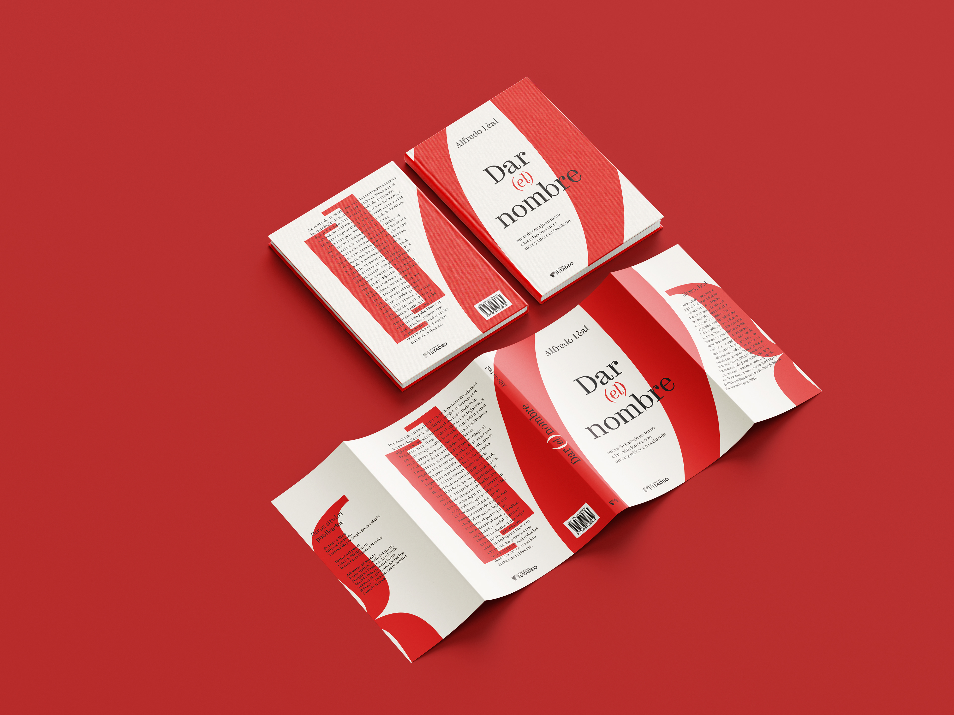
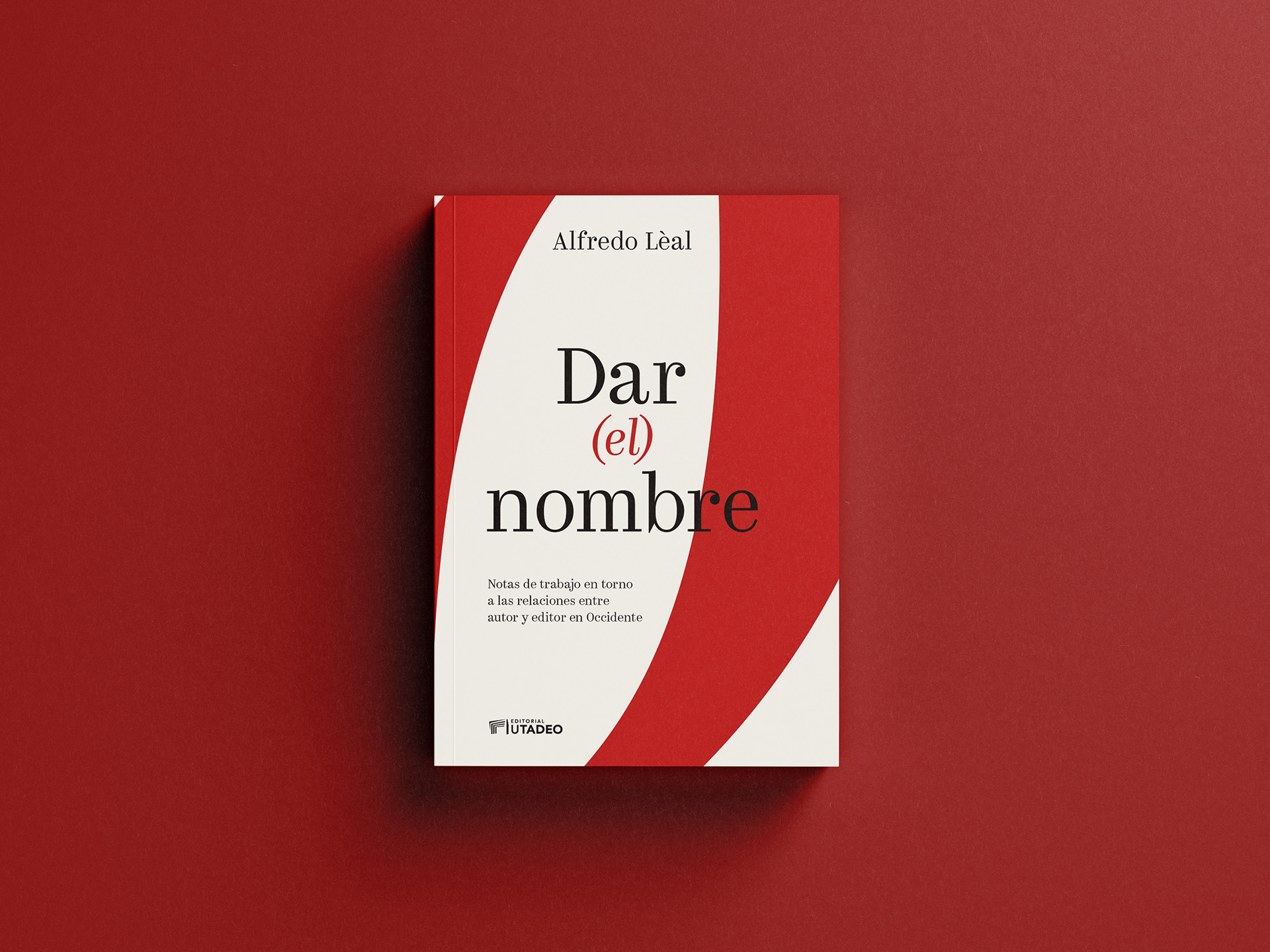
Diseño de portada, diagramación del libro y conceptualización de “Dar (el) nombre” publicado por la editorial de la Universidad de Bogotá Jorge Tadeo Lozano.
Contexto: el ensayo de Alfredo Lèal explora la relación entre autor y editor en la historia literaria de Occidente. A través de notas de trabajo, el autor reflexiona sobre las marcas que dejan quienes participan en la publicación de un libro con cada una de las decisiones tomadas.
Reto: diseñar un libro a partir de una idea compleja, abstracta y difícil de materializar. El título del libro es un juego conceptual, donde los paréntesis juegan un rol fundamental para dar espacio a una decisión, un camino elegido que se acuerda entre el autor y el editor. No es Dar un nombre cualquiera… es Dar (el) nombre. La cubierta y la diagramación debían hacer visible ese juego intelectual sin ilustrarlo de manera literal.
Decisiones de diseño: la tipografía se convirtió en el eje visual. En vista de la importancia del paréntesis para dar lugar a las decisiones entre autor-editor, se usaron distintos estilos tipográficos de paréntesis (redondo, cuadrado, llave) para ejecutar el gesto central del libro, es decir, partir el lenguaje para exponer lo que vive dentro. En la diagramación, el juego continua porque las cornisas están dispuestas para hacer también las veces de paréntesis, abarcando la totalidad del texto de este ensayo dentro de ellas.
El resultado: una cubierta que no describe el libro, lo ejecuta. El diseño sugiere el argumento para el lector antes de que este llegue a la primera página, haciendo del acto de nombrar tanto el tema como la forma.