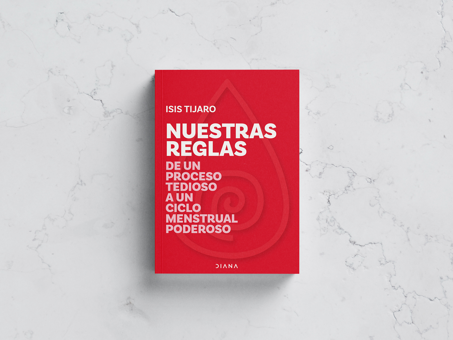
Cover and layout design for the book "Nuestras reglas" (our periods), published by Diana (a publishing imprint focused on wellness topics from Grupo Planeta).
Context: This book confronts the taboo that exists around periods in society, inviting people who menstruate to approach in a different way to recognize theirs in its multiple dimensions.
Challenge: How can every visual decision (from the cover to the smallest detail inside) reinforce the message? Menstruation is a topic that has historically been rendered invisible. The design had to be as direct as the book itself.
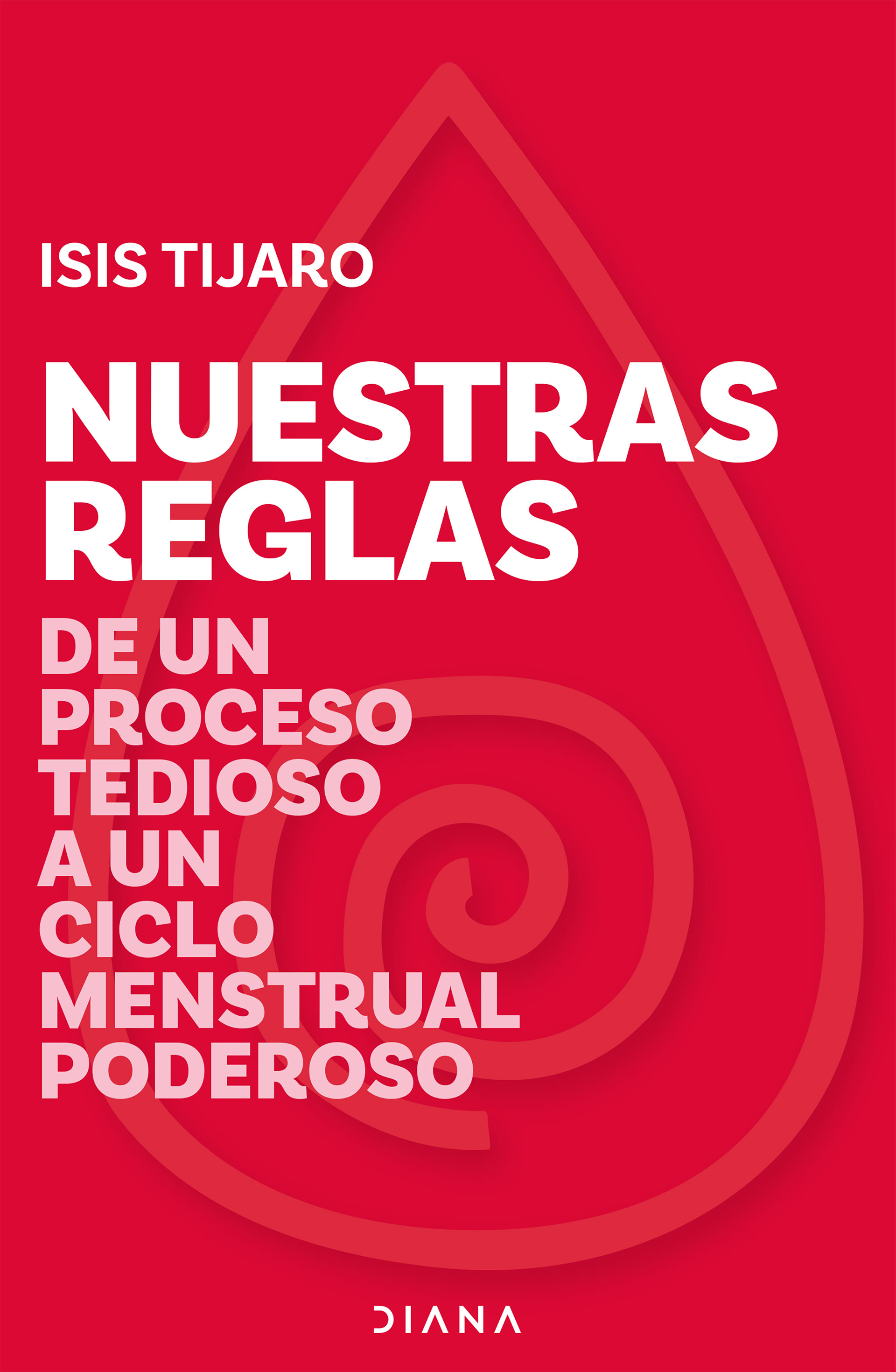
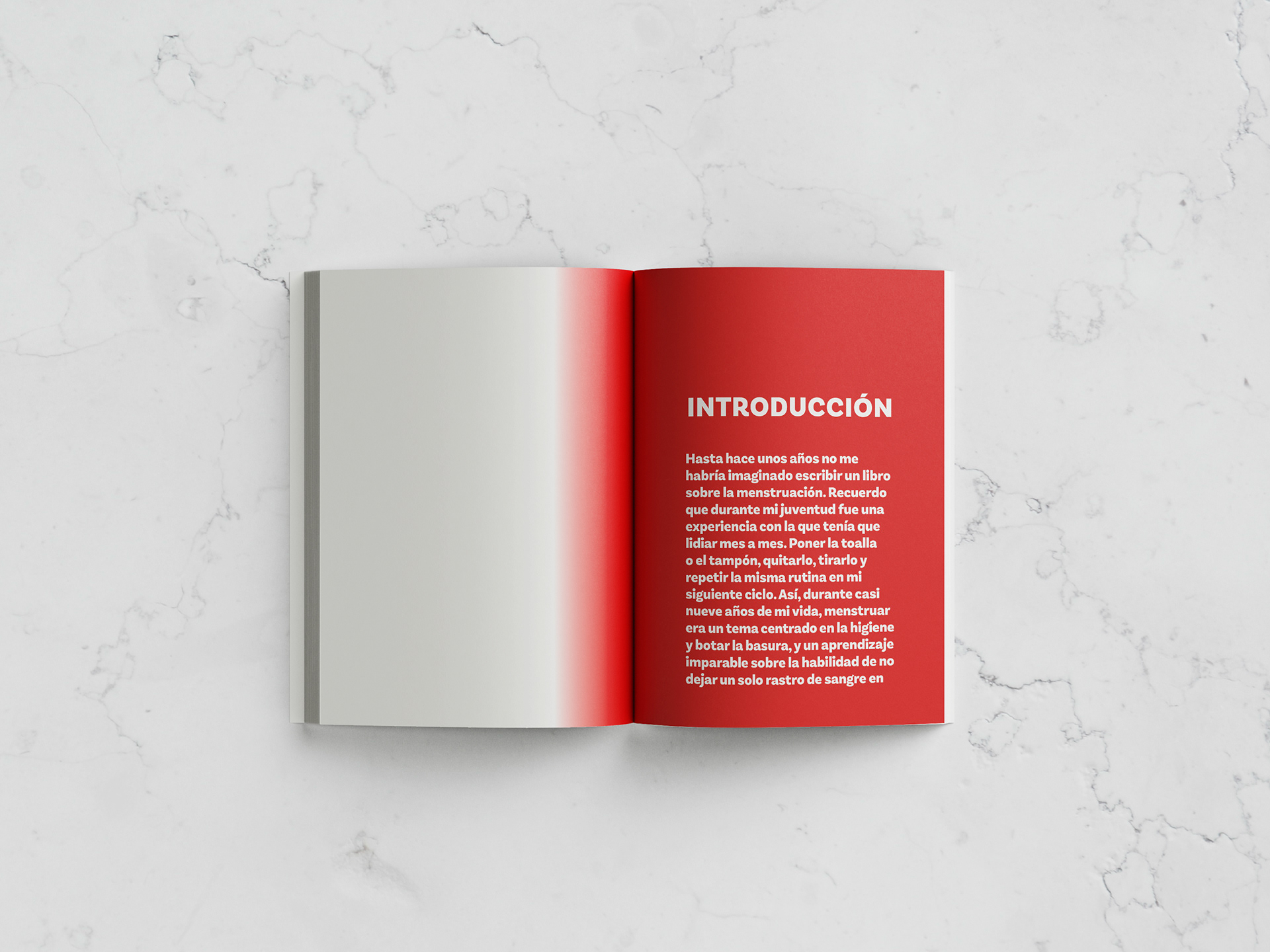
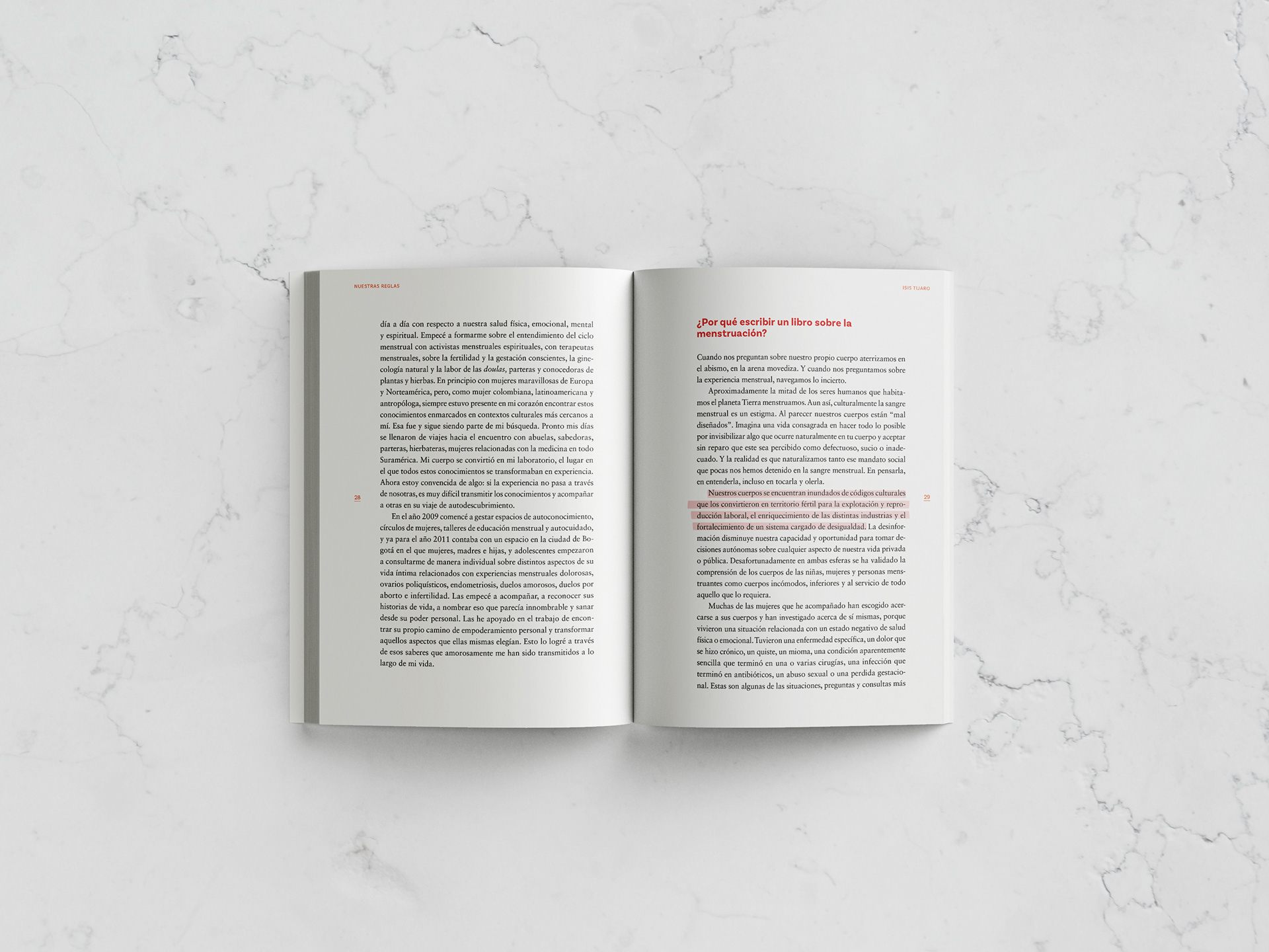
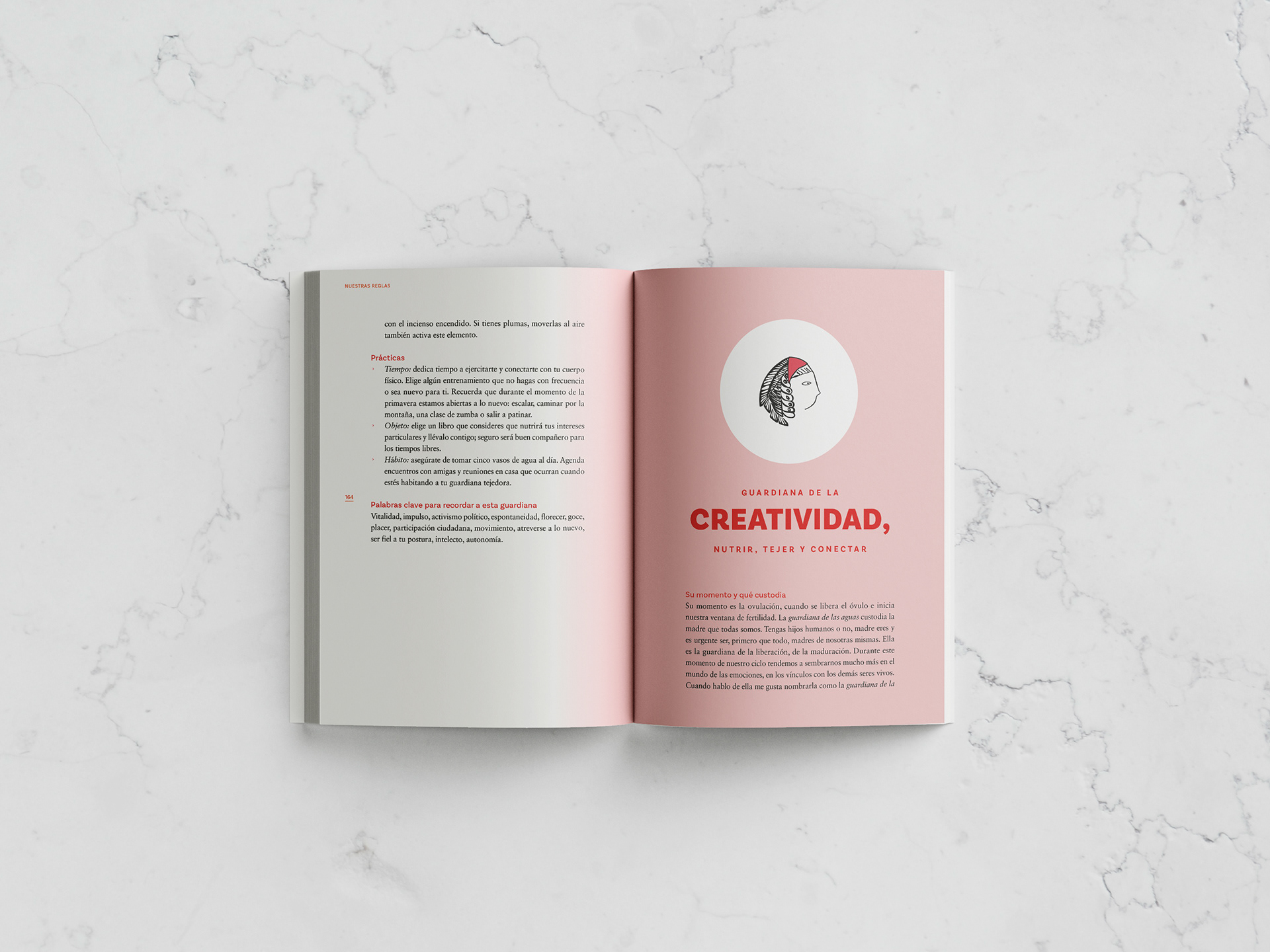
Design decisions: In line with the message this book aims to convey, I designed the cover and interior with various elements that emphasize visibility, passion, and the desire to show things as they are, without holding back. I used elements alluding to menstrual bleeding in the underlining of text, as well as at the beginning and end of chapters. The red at the beginning of the chapters alludes to menstruation as it is—in its true color, without nuance, without pretense, without taboos. Another visual reference was social protest signs (large, bold typography, designed to be seen from a distance and read without ambiguity). That same energy was carried over to the cover and the chapter openings: not as decoration, but as a statement. Furthermore, other design elements reference menstruation as a changing process that is unique to each woman. From this idea stem the irregular underlines in the text and the choice of different shades of red for the guardians in the book, with the understanding that these correspond to different moments in the menstrual cycle.
The result: That design can be a communication system with conceptual coherence from start to finish, where every decision, no matter how small, has a rationale that goes beyond visual preference.
Diseño de portada y diagramación del libro "Nuestras reglas" de la editorial Planeta (sello Diana, sello enfocado en salud y bienestar principalmente).
Contexto: este libro confronta el tabú que existe en torno a la menstruación en la sociedad, invitando a las personas menstruantes a acercarse de una manera diferente a reconocer sus múltiples dimensiones.
Reto: ¿cómo hacer que cada decisión visual (desde la portada hasta el detalle más pequeño del interior) refuerce el mensaje? La menstruación es un tema históricamente invisibilizado. El diseño tenía que ser tan directo como el libro.
Decisiones de diseño: en línea con la reivindicación que pretende este libro, diseñé la cubierta y el interior de este libro con diferentes elementos que apelan a la visibilidad, a la vehemencia, a mostrar las cosas como son y sin tapujos. Usé elementos alusivos al sangrado menstrual en el subrayado de textos, al igual que al inicio y finalización de capítulos. El rojo al inicio de los capítulos alude a la menstruación tal y como es, del color que corresponde, sin matices, sin tapujos, sin tabúes. Otra referencia visual fueron los carteles de manifestación social (tipografía grande, contundente, hecha para ser vista desde lejos y leída sin ambigüedad). Esa misma energía se trasladó a la portada y a los inicios de capítulo: no como decoración, sino como postura. Por otra parte, otros elementos del diseño hacen referencia a la menstruación como proceso cambiante y único para cada mujer. De esa idea se desprenden los subrayados irregulares en el texto y la elección de diferentes tonalidades de rojo para las guardianas en el libro, entendiendo que éstas corresponden a diferentes momentos del ciclo menstrual.
El resultado: el diseño puede ser un sistema de comunicación con coherencia conceptual de principio a fin, donde cada decisión, por pequeña que sea, tiene una razón que va más allá de la preferencia visual.